TUTORIAL
How to Build a React Reusable Calendar Component
by Marryam Mubariz
Project Overview
EXPERIENCE LEVEL: Entry-level
TIME TO COMPLETE: 1-2 hours
ESTIMATED COST: N/A
YIELD: A React Reusable Calendar Component
Skills Needed
Basic knowledge of JavaScript and React
Familiarity with React hooks, particularly useState, will be beneficial.
Tools and Materials
A computer with Node.js and npm (Node Package Manager) installed
A code editor (we recommend Visual Studio Code)
React development environment (create-react-app or similar)
Moment.js library for date handling
react-router-dom package for implementing routing
Styled components package for styling
A modern web browser for testing (Chrome, Firefox, or Safari)
Command-line interface (Terminal on Mac/Linux or Command Prompt on Windows)
Internet connection to install packages and access documentation
Before you Begin
In this project, you'll create a flexible React calendar component from scratch. You'll start with a basic structure and then transform it into a controlled component. You'll make it library-agnostic, add query parameter support, and style it using styled components.
By the end, you'll have a versatile calendar that can be easily integrated into various React projects. It is suitable for event planners, booking systems, or simple date displays.
Make sure you have a code editor ready, such as Visual Studio Code. While we'll be using Moment.js for date handling, don't worry if you're not familiar with it – we'll cover the essentials.
Lastly, prepare to learn about styled components for styling our calendar component.
Are you tired of creating the same calendar functionality for every new project? Imagine having a single, reusable calendar component that you can easily integrate into any React application.
In this React calendar tutorial, we'll create a reusable calendar component in React. We'll start with a basic calendar and transform it into a super flexible component.
We'll also explore React concepts like props and state management. Don't worry if some of this sounds new—we'll break it down step by step.
By the time we're done, you'll have a calendar component that you can easily plug into any React project. Whether you're building an event planner, a booking system, or just need to display dates, this calendar will have you covered. Let’s start building our reusable calendar.
An Overview of How to Build a React Reusable Calendar Component [Video]
In this video, CBT Nuggets trainer Shaun Wassell demonstrates how to build a reusable calendar component in React using Moment.js. This versatile component can be used to create event tracker applications and a React date time picker.
How to Build a React Reusable Calendar Component
To build a reusable React calendar component, we'll start with a basic structure using useState and Moment.js. First, manage the current date and render the calendar.
Then, move state management to a parent component to make it a controlled component. This gives you more control and flexibility. Create an interface that doesn't depend on any specific library so it can work with any date library or plain JavaScript dates.
Add support for query parameters to share specific calendar views easily. Style your component with styled-components to give it a polished look.
Focus on adapting the component to different use cases. This way, it can be easily integrated into various React projects, making your calendar versatile and highly reusable.
Step 1: Setting Up the Basic Calendar Structure
First, we'll focus on three key aspects: creating a basic layout, displaying the current month, and adding navigation buttons.
Start by setting up a basic calendar structure using React components. This will likely include a main Calendar component that renders the month name and a grid of days.
We'll use the useState hook and the Moment.js library to display the current month.
Now that we have the useState hook, we'll use it to add a state to our calendar component, which will determine the current month to display in the calendar.
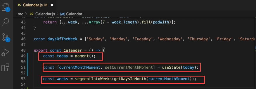
I initialized the component by creating a “today” constant using the moment() function, representing the current date. This serves as the starting point for the calendar display.
Next, the useState hook is employed to create a state variable called "currentMonthMoment" and its setter function “setCurrentMonthMoment.” The initial value for this state is set to “today,” meaning the calendar will initially display the current month.
Using the state to manage the current month, the component can update and re-render when the month changes. This is crucial for allowing users to navigate between months.
The "weeks" constant is then calculated using the “segmentIntoWeeks” function, which takes the days of the current month (obtained from “currentMonthMoment”) and organizes them into weeks. This calculation will be re-run whenever “currentMonthMoment” changes, ensuring the calendar displays the correct days for the selected month.
This approach sets up the foundation for a dynamic calendar component.
Now, we'll add two buttons to enable users to change the month. These buttons will call separate functions: one to increment the month and one to decrement it. Let's implement these functions now.
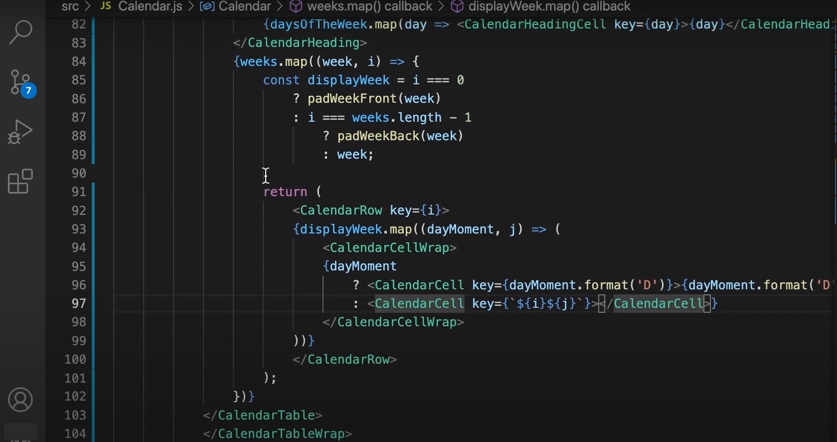
incrementMonth Function
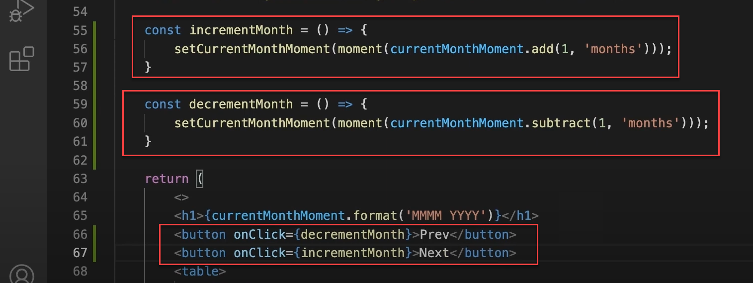
For incrementMonth, we're doing something tricky. We can't just add a month to our current state directly because React might not catch that change.
Instead, we're creating a whole new moment object. We do this by wrapping our “currentMonthMoment” in a new moment() call, then adding a month to it. This way, React definitely sees it as a new thing and updates accordingly.
decrementMonth Function
The “decrementMonth” function performs a similar process but subtracts a month instead of adding one.
Add Simple Navigation Buttons (Previous and Next Month)
Now, the interesting bit is how we're using these functions. Down in the return statement, we've got two buttons. When clicked, the "Prev" button triggers decrementMonth, and the "Next" button fires off incrementMonth.
Between these buttons, we're showing the current month and year. That format ('MMMM YYYY') bit? It's just to make sure it looks nice and readable, like "Jan 2024" or whatever.
So, basically, whenever someone clicks these buttons, they're shuffling the calendar back and forth by a month. Because we're clever with how we update the state, React catches these changes and redraws everything properly.
Alright, let's test our implementation to ensure everything works. We have our two buttons, "Previous" and "Next." While they're not styled yet, they function correctly.
Clicking these buttons changes the month, and if we navigate from December to the next month, it automatically switches to January of the following year.

The "Previous" button works similarly. Our calendar correctly displays the first and last days of the month and fills the rest of the cells accurately.
Step 2: Making the Calendar Component Controlled
Now that we've added the "Previous" and "Next" buttons to our calendar, the next question to consider is whether this component is as reusable as it could be. The answer, unfortunately, is no, and here's why.
Our current calendar setup is quite restrictive. The parent component has no control over the displayed month; it defaults to the current month, and users have to navigate manually. This approach is not ideal for scenarios like viewing past years.
What are Controlled Components?
Controlled components in React get all their data and behavior from their parent component through props. They don't have their own state; instead, the parent component manages it, making them easier to reuse and manage.
This is often seen with forms and models, where the parent component controls what is shown and what happens.
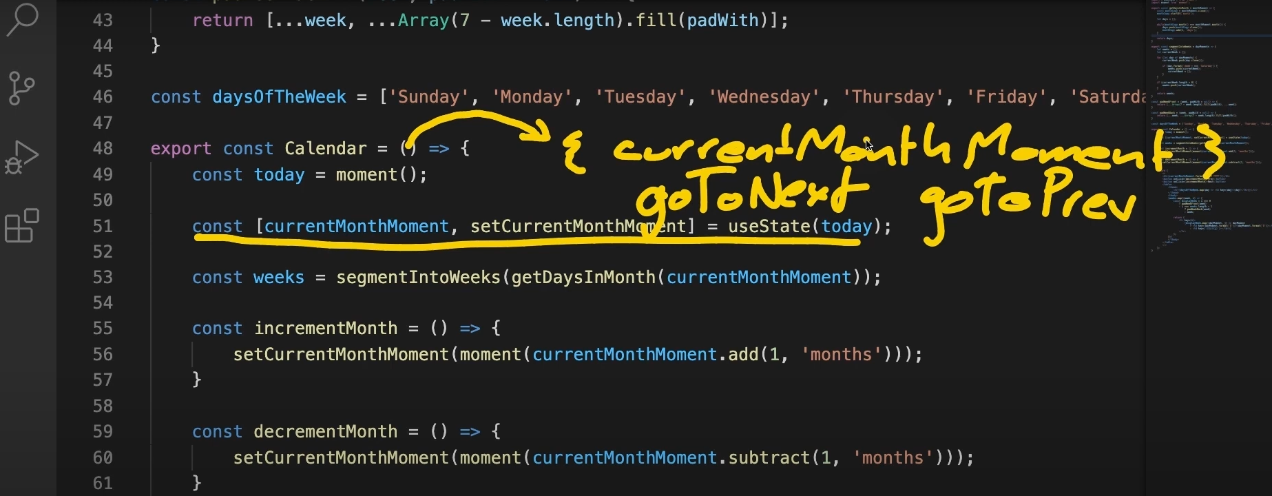
So, to make our calendar more flexible, we'll allow it to accept the current month as a prop. The parent component will manage the state, including navigating to the next or previous month through props like currentMonthMoment, goToNext, and goToPrevious. This approach, known as controlled components, is a common pattern in React applications.
CalenderController.js
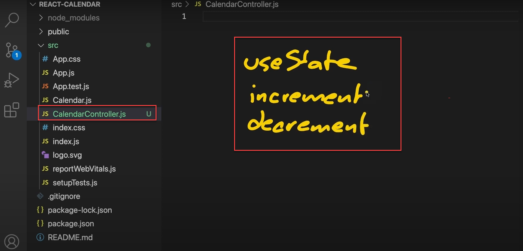
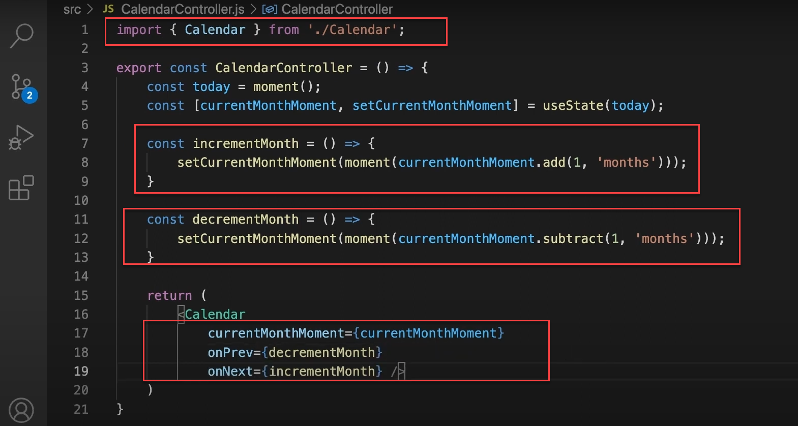
Now, we're going to create another component called “CalendarController.js.” This component will be the brain of our calendar operation. It contains the following things:
useState: for managing which month we're showing
increment and decrement functions: for changing months
This CalendarController will handle all the state stuff and month-changing logic, then pass it down to the actual Calendar component as props.
Alright, let's see what this will look like now in code.
We're importing the Calendar component at the top.
We've created a new CalendarController component. It's a functional component that doesn't take any props for now.
Inside this component, we've moved all the state logic that was previously in the Calendar:
We're using useState to manage the currentMonthMoment, initializing it with today's date.
We've got incrementMonth and decrementMonth functions that update this state.
These functions create a new moment object when changing months, ensuring React detects the state change.
At the bottom, we're returning the Calendar component. We'll pass the state and functions as props to this Calendar later.
So we've taken all the smart stuff - the state management and month-changing logic - and put it in this controller. The Calendar component will now just focus on displaying the data it receives. This separation makes our calendar setup more flexible and easier to manage.
Changes to Calendar Component
Now, we just need to add some props to our calendar component so we can pass the necessary data into it.
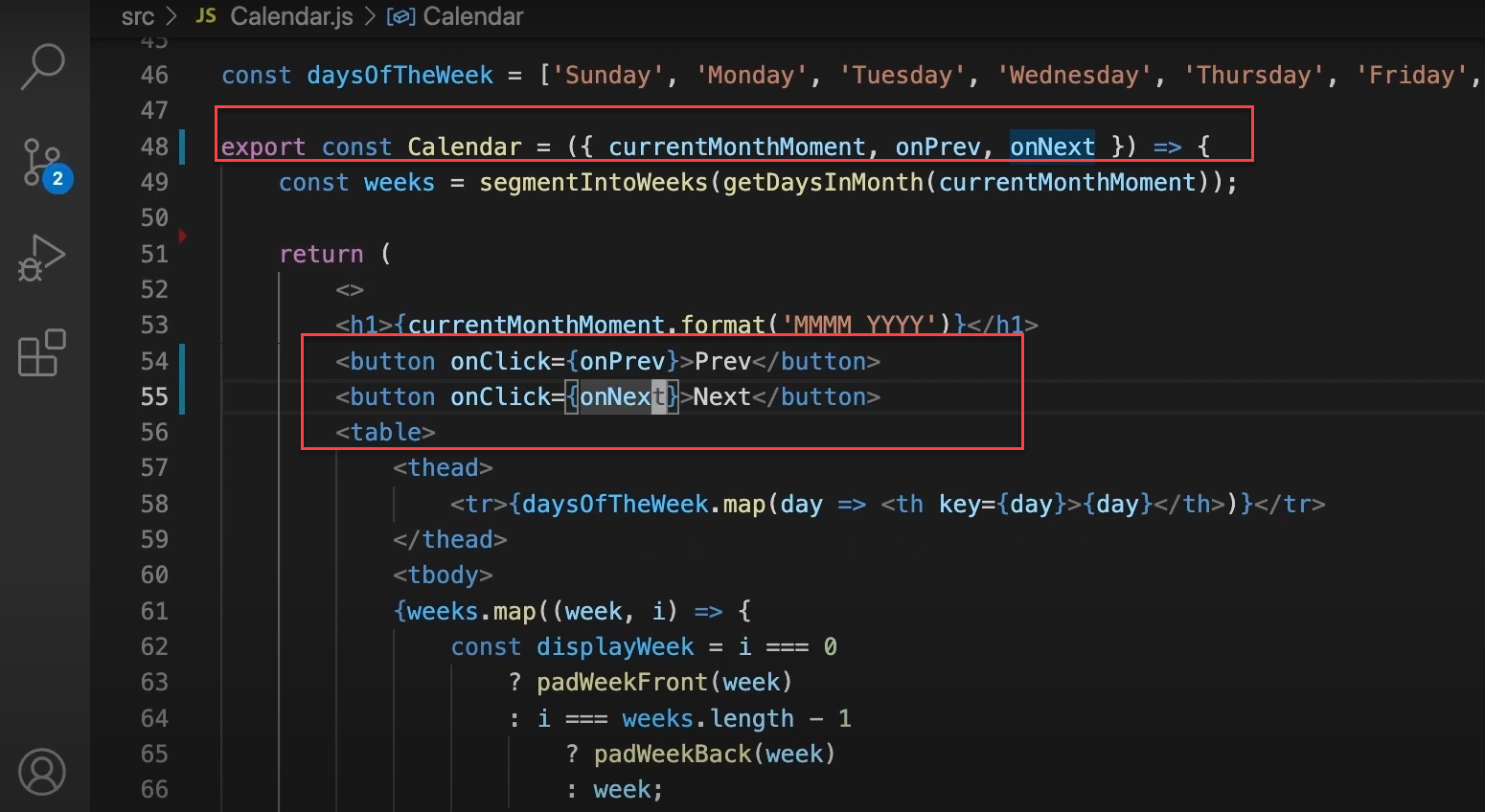
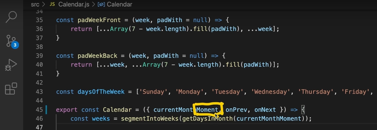
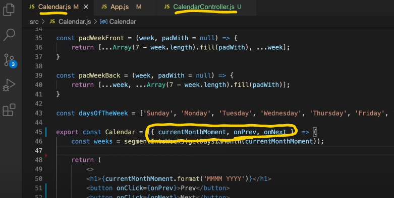
The component now takes three props: currentMonthMoment, onPrev, and onNext. This is a big change from before - we're no longer handling state directly in this component.
Inside the component, we use these props to display the current month and handle navigation. The currentMonthMoment prop shows the current month and year in the h1 tag.
For the navigation buttons, we've swapped out the old incrementMonth and decrementMonth functions with the onPrev and onNext props.
This setup makes our Calendar component more flexible. It's now a "controlled" component, meaning its parent (the CalendarController) controls all its important data and behaviors. The Calendar just focuses on rendering based on what it's given.
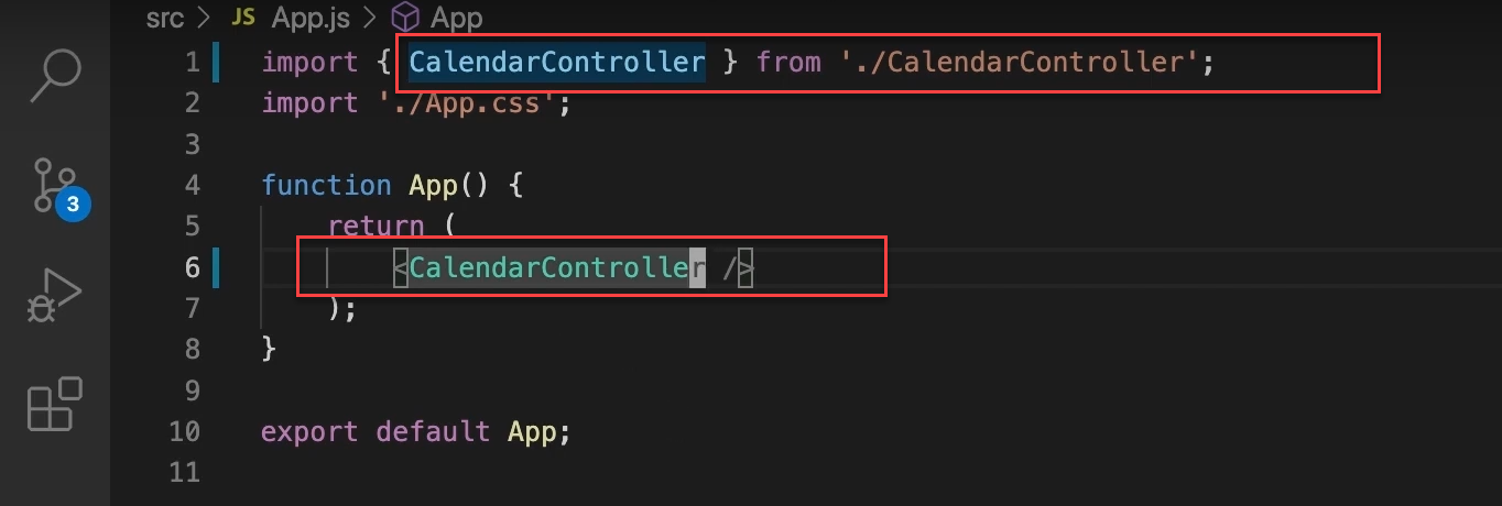
Now, let's open our app component. Instead of displaying our “calendar” component, we'll display our “CalendarController.” Replace the “Calendar” component with the “CalendarController” and display it accordingly.
Additionally, we need to import some supporting libraries into our calendar controller, like moment and the useState hook from React. So, we'll add import moment from 'moment' and import { useState } from "react." That should cover everything we need.
Let's also remove those things from our calendar now since we no longer need them.
Our calendar component no longer has direct dependencies, making it more flexible. The parent component, such as the calendar controller, can now manage the state and implement custom logic for month navigation and other behaviors.
Step 3: Creating a Library-Agnostic Interface
We've made our calendar component pretty reusable, but there's still a sneaky issue we need to address. The problem lies in using the Moment.js library, specifically in the “currentMonthMoment” prop.
Using Moment.js directly in our component interface is problematic because it forces any parent component using our calendar to also use Moment.js, which significantly limits our component's reusability.
For instance, if a parent component prefers to use JavaScript's built-in Date object, they'd be out of luck.
When building truly reusable components, we want to avoid forcing specific libraries on the parent components. Imagine if we were creating this calendar for other developers to use in their projects - they might not be thrilled about including “Moment.js” just to use our calendar.
To fix this, we will make our component "library agnostic." This means it won't force the parent component to use any specific date library. We'll still use Moment.js internally in both the “CalendarController” and the “Calendar” components, but we'll change the interface between them (the props) so it doesn't rely on any specific library.
This approach makes our calendar component much more flexible and easier for other developers to integrate into their projects, regardless of the date handling library (if any) they use.
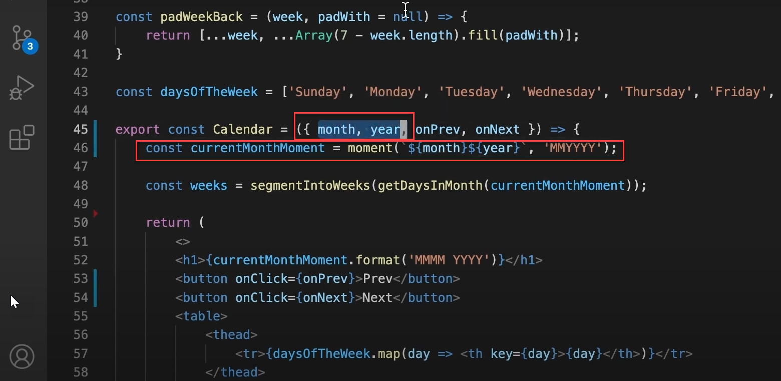
Instead of using a “currentMonthMoment” prop, we'll let the parent component pass in the year and month as props. This creates a clean interface, allowing the parent to use any library or no library at all. The parent just needs to pass in a year (like 2021) and a month (like 8).
We'll modify the “Calendar” component by replacing the currentMonthMoment prop with month and year props. Inside the component, we'll create a moment object using these props:
This approach allows us to use the moment library within the component without requiring the parent component to include it. The string template ${month}${year} combined with the “MMYYYY” format tells the moment how to parse the date correctly.
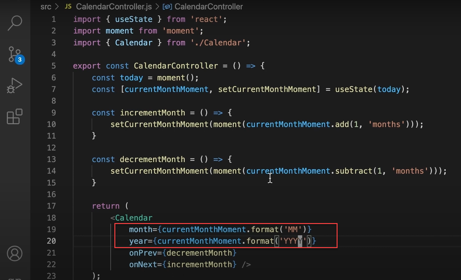
Next, we need to adjust our calendar controller for the new interface between our calendar and its parent. Instead of passing the currentMonthMoment prop, we'll now pass the month and year. We'll format these as currentMonthMoment.format('MM') for the month and currentMonthMoment.format('YYYY') for the year.
Again, import the moment library into our “Calendar” component: import moment from "moment." Once that's done, our application should work as before but with a more flexible calendar component.
Step 4: Implementing Query Parameter Support
Now that our calendar component is reusable, you might wonder how else we can use it. To show its flexibility, we'll make a new calendar controller that uses query parameters to track the current month. It means users can select a month through the URL, making it easy to share specific calendar views.
We'll add a router to our app to access these query parameters. The new controller will read the parameters and update the calendar. This way, users can copy and paste the URL to share the exact month and year view with friends.
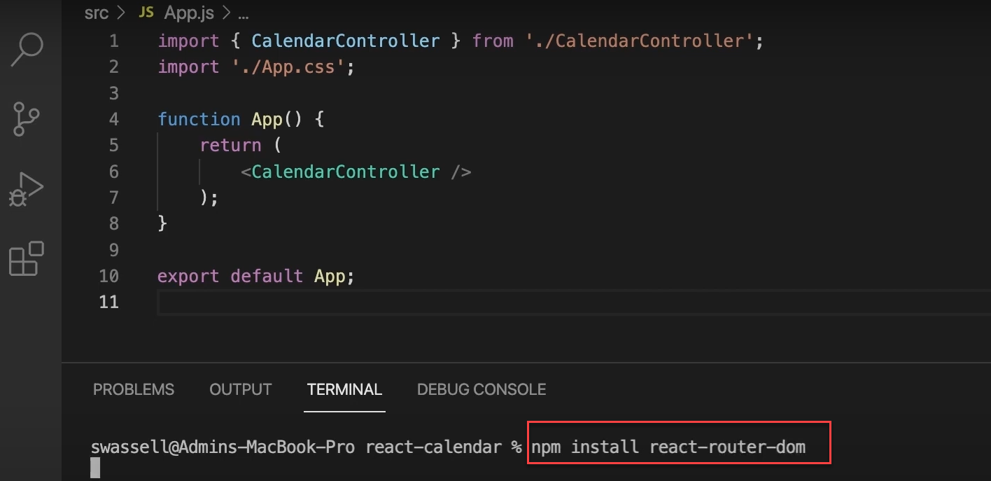
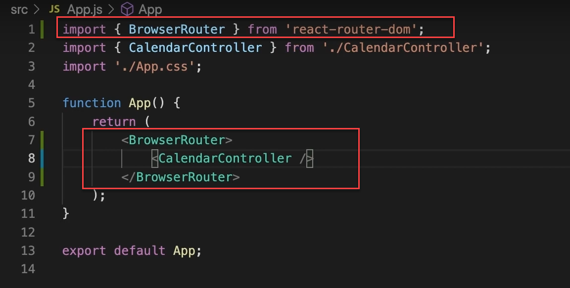
First, we'll open our app component and add a router. To do this, we need to install the react-router-dom package, which includes all the necessary routing components in React.
Once that's installed, we'll import BrowserRouter from react-router-dom. Then, we'll wrap our component with BrowserRouter and place our calendar controller inside it.
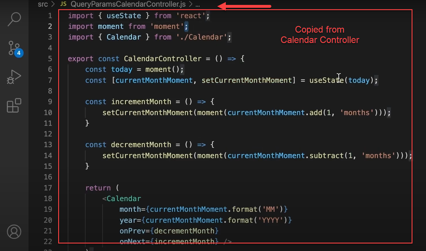
Next, we'll create a new calendar controller to handle loading and setting the query parameters. We'll create a new file named something like QueryParametersCalendarController.
To start, we'll copy and paste our existing calendar controller into this new file and then make a few additions to it.
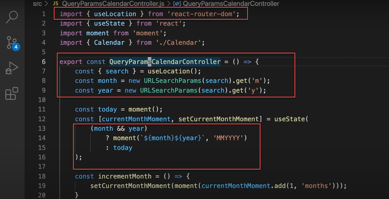
Now, instead of setting the moment to today automatically, we'll load the month and year query parameters from the URL. To keep the URL shorter, we can use “y” for the year and “m” for the month.
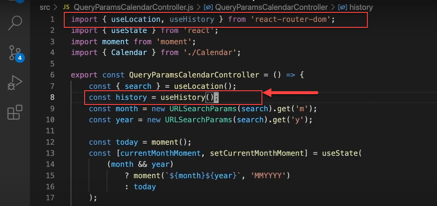
To get these parameters, we'll import the “useLocation” hook from the react-router-dom package. Inside our component, we'll make the following changes:
Inside the component, we use useLocation() to get the search string containing query parameters.
We extract month and year from the URL using URLSearchParams:
We use useState to manage the current month, initializing it based on URL parameters or defaulting to today:
Now, let's return to App.js and replace the previous calendar controller with “QueryParamsCalendarController.”
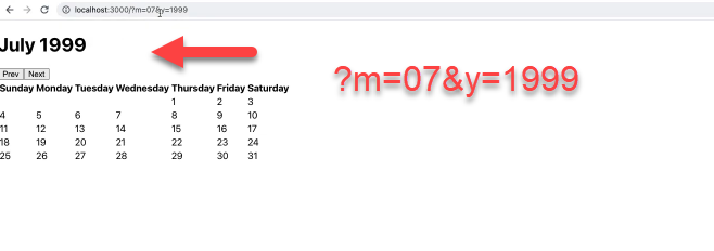
Let's make sure our app is running with npm run start. Now, if we add some query parameters in the URL, such as ?month=07 year=1999, and hit enter, we should see July 1999 displayed in our calendar.
However, as we click the "Previous" and "Next" buttons, we notice that the query parameters don't sync with the currently selected month.
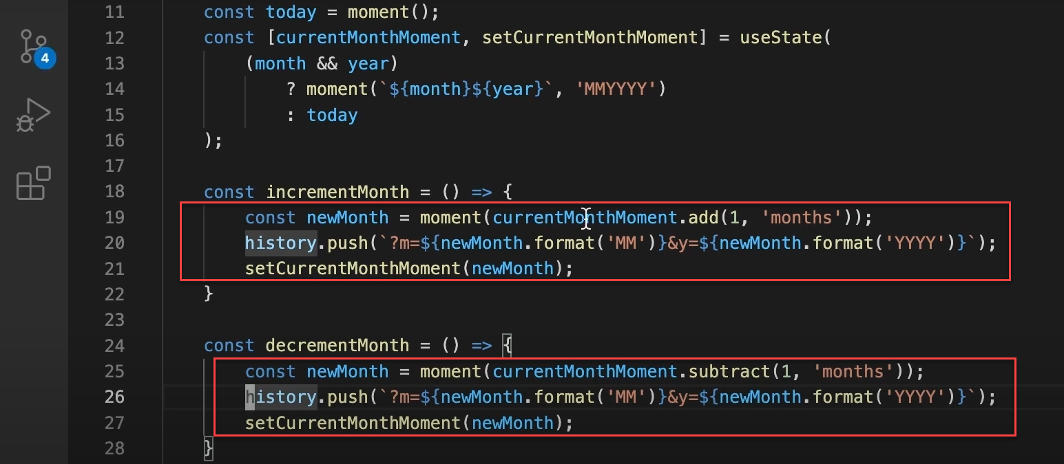
To keep the query parameters in sync with the selected month, we'll need to update our QueryParamsCalendarController. We'll modify the incrementMonth and decrementMonth functions to set the new query parameters as the changes occur.
Instead of just setting currentMonthMoment right away, we'll assign the new month to a constant called newMonth. Then, we'll update the URL with history.push using the new query parameters.
Here's how to do it:
Calculate the new month
Update the URL with the new query parameters
Finally, set currentMonthMoment to the new month
Repeat the same process for decrementing the month, but use subtract instead of add.
We need to use the useHistory hook correctly. I got ahead of myself with the history.push part. So, let's import useLocation and useHistory from react-router-dom. Then, we'll add the following line in our component:
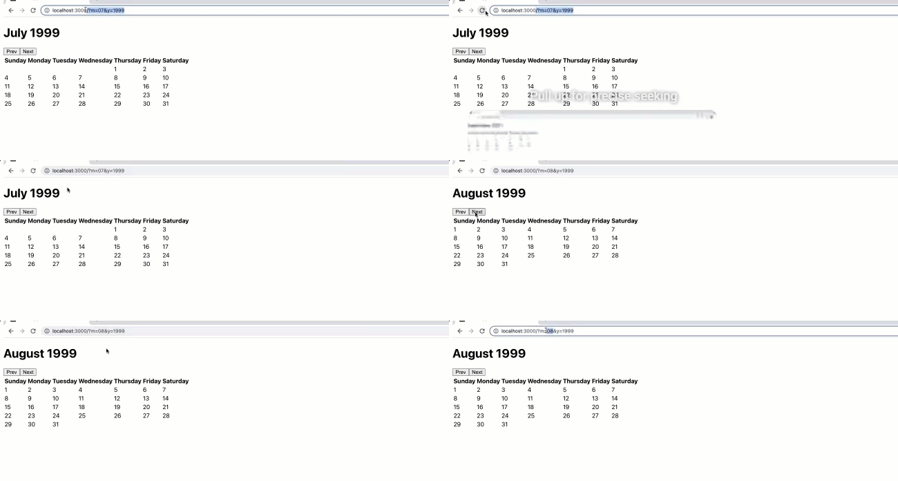
Now, when we navigate to July 1999 and click "Next," the query parameters in the URL will automatically update to reflect the current month displayed in the calendar.
Now that we've built a reusable calendar component, the next step is to improve its appearance by adding some styles.
Step 5: Styling the Calendar Component
To style our calendar, we could use CSS modules, but instead, I'll show you how to use a package called styled-components in React. Styled components allow us to define styles directly in our JSX as components.
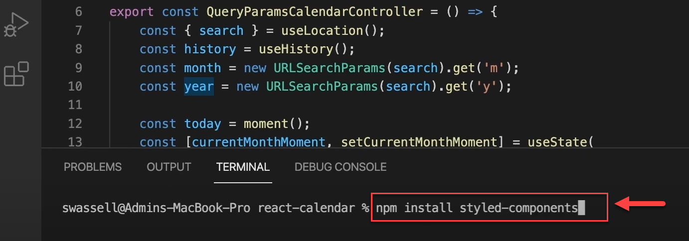
To get started, install the styled-components package by running:
Let's open our calendar component and define some styles. First, we'll clean up the file by moving utility functions to a new file.
Create a new file called util.js and copy all the calendar utilities, like daysOfTheWeek, padWeekBack, padWeekFront, etc., into it. Make sure to export these functions:
Next, import these utilities into our calendar component. We're importing those from the utility file that we just created.
Now, let's add some styles using the styled-components package. First, import styled from styled-components.
Next, we'll define the styled components we want to display inside our calendar component. We'll start with CalendarControlsWrap, which includes the current month, the previous button, and the next button.
This sets the height to 15% of the container, ensuring it takes up the top portion of our calendar.
Now, let's define CalendarControls to style the controls section:
Alright, we have our CalendarControlsWrap and CalendarControls setup. To use these styled components in our JSX, we simply insert them as tags.
Here's how to do it:
This applies the styles we defined to both elements. It's similar to using a div with class names but more convenient and readable with styled components. Now, let's see how it looks.
Now, we can see that our CalendarControls are nicely centered on the page, with the "Previous" and "Next" buttons looking much better.
They could still use some improvement, so let's add some quick styles for our buttons in index.css. We'll give all buttons a black background color, remove their borders, and add an 8px border-radius.
Additionally, we'll set the text color to white, make the cursor a pointer, and apply a font size of 16px with 16px padding. These styles will apply to all buttons in our application:
Now, if we go back and look at our app (you might need to refresh), our "Previous" and "Next" buttons should look much nicer than before.
We're now styling the table portion of our calendar component. To achieve more flexible styling, we'll create a styled component called CalendarTable using styled.div instead of an actual table element.
The CalendarTable component will have these key styles:
Height: 85% (leaving 15% for CalendarControls)
Display: flex
Flex-direction: column (for the vertical arrangement of rows)
Width: 100% (to fill its container horizontally)
Next, let's style our CalendarRow. We'll create another styled component for it:
This makes CalendarRow a flex container that takes up an equal amount of space within the CalendarTable container.
Next, let's create the CalendarTableWrap component for specific styling of the CalendarTable:
This ensures that the CalendarTable takes up the desired space. Next, let's define our CalendarHeading:
Then, we'll define our CalendarHeadingCell:
Next, we'll define styles for the actual cells of our calendar. First, we'll create CalendarCellWrap:
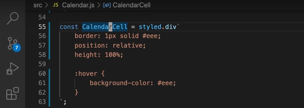
Lastly, let's define the styling for each of our calendar cells. We'll create Cell:
Now, let's wrap everything inside the CalendarTableWrap component we created earlier. We'll then replace the table element with our CalendarTable styled component. Next, change thead to CalendarHeading, delete the table row, and display each cell with CalendarHeadingCell. Be sure to update the closing tags accordingly:
Now, for the actual body of our table, we can remove the tbody since we don't need it anymore. We're using divs now, so the head and body distinction isn't necessary.
We'll replace the table with CalendarTable and change each row to CalendarRow. For the display week, we'll wrap everything inside a CalendarCellWrap and change all tds to CalendarCell.
Let's go back and take a look. Sure enough, our calendar is looking great!
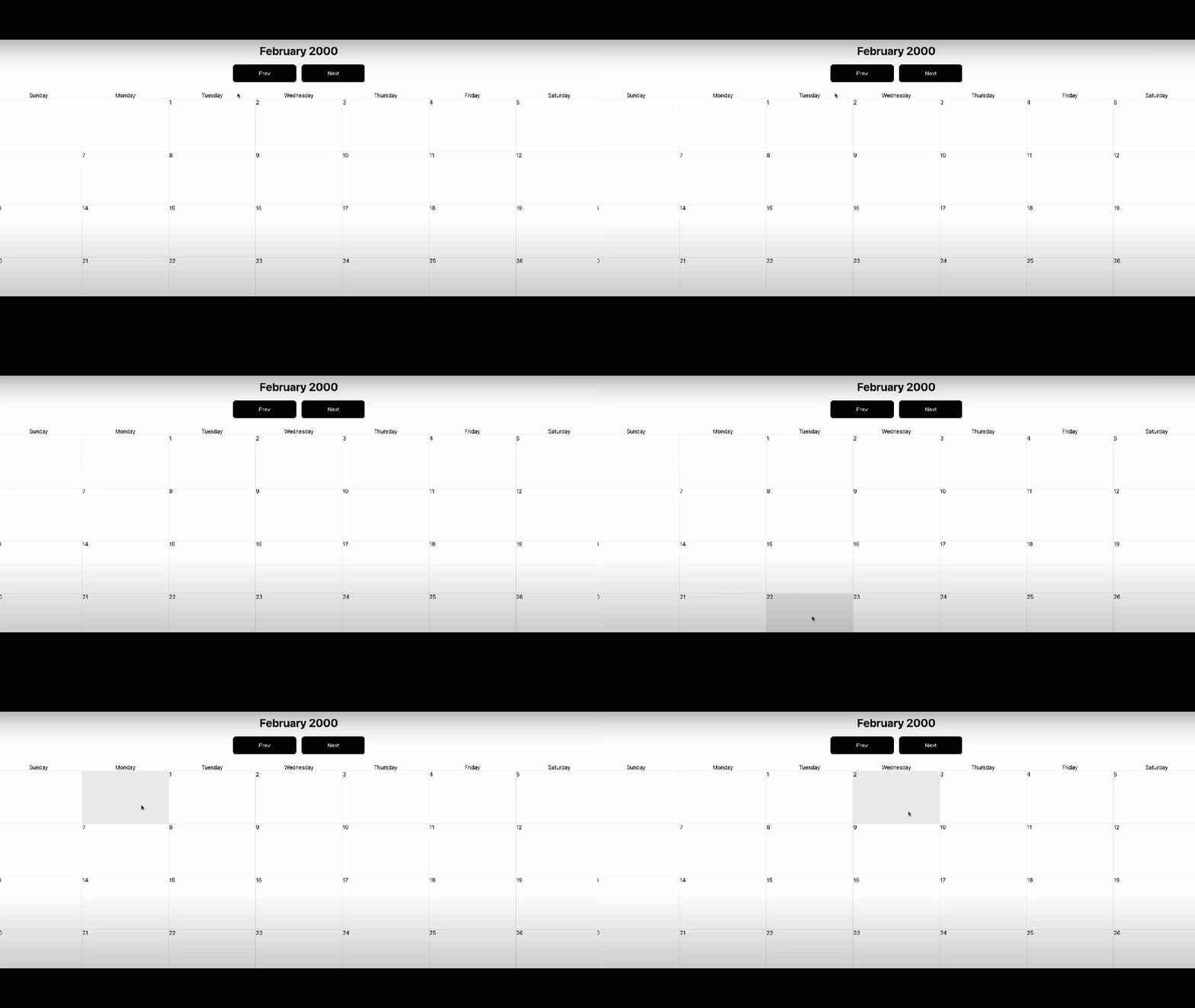
Hovering over each day changes the cell's background color, and we can navigate from date to date smoothly. Our calendar now looks like a real calendar you might find on a website.
Conclusion
As we wrap up this project, let's take a moment to reflect on what we've accomplished together. We've successfully built a reusable React calendar component from the ground up, and I'm proud of our journey.
We started by creating a basic calendar structure and gradually improved its functionality and flexibility. Remember how we made it a controlled component? That was a game-changer for reusability.
We didn't stop there—we went on to create a library-agnostic interface, making our component even more versatile. Adding query parameter support was particularly exciting, as it allowed us to share specific calendar views through URLs.
Finally, we gave our calendar a polished look using styled-components. Looking at the final product, I'm impressed by how far we've come from that initial basic structure.
This project has been a great opportunity to apply various React concepts, from state management to styling. But our learning journey doesn't have to end here.
I encourage you to keep exploring and expanding on this component. How about adding event management features or different view modes? The possibilities are endless.
If you're eager to dive deeper into React development, I highly recommend checking out our comprehensive React course. It covers everything we've touched on here and so much more.
Visit our main page for a variety of IT tutorials and CBT Nuggets training. You'll find courses on cloud services, networking, cybersecurity, and certifications.

